How Real Kids Create Real Infographics
Blending meaningful questions with quality data and time to create
April 27, 2014
Kerry Gallagher
Infographics are a visually stunning way to deliver facts and statistics to readers. They have become incredibly popular recently on Pinterest, Twitter, and lots of other social media tools because users are looking for a quick way to get reliable information. Great infographics answer questions that people are interested in answering.
They also require lots of research, reading, and analysis to create. Sounded like a perfect activity for my students--and it could be for yours as well!
Lesson Preparation
Essential Question
First, I needed to create an essential question. Answering this question would be the goal of their infographic. As an introduction to our Civil War unit, our essential question was:
How did the differences between the North and South affect each region's strategy and success in the Civil War?
Numbers to Crunch
Next, I needed to provide the information and data my students needed to answer the question. I found a few sources for statistics: slavery statistics I received at a scholar lecture a few years ago (here is a recent article from The Root with some of the same information), documents from a DBQ my school purchased from the DBQ Project, and an excerpt from an old U.S. history text book on Union and Confederate strategy. The facts and statistics alone are not enough for my young teenage students. They also needed a few guiding questions to help them interpret the numbers and read between the lines.
What Makes a Great Infographic?
Of course, in addition to content my students need guidance on the task at hand. This means they needed a tutorial on what an infographic is. I found this infographic on good infographics, cropped it for my own purposes, and showed them this version:
NEWSLETTERS
STAY AHEAD IN EDUCATION.
Sign up for EdSurge newsletters for timely news, insights and analysis.
They also needed modeling, so I found this article on 50 great infographics that they could check out on their own. A video tutorial on what makes a great infographic wouldn't hurt either, so I threw that in too.
Choose the Tool
Finally, I chose an infographic creation tool. After reviewing suggestions from edtech integration experts in my PLN like Richard Byrne (Free Technology for Teachers) and Greg Kulowiec (edtechteacher), I decided on infogr.am. I also found a screencast on how to get started with infogr.am so that my students would have as smooth an experience as possible with the tool.
However, as with all of my projects, if students have another tool they prefer that will accomplish the same goal, I'm fine with it. Process is much more important that product.
Teacher as Facilitator
I set up the whole lesson so that my students could access all of the information they needed in one place on our class website. This way they can easily access the resources in class, at home, or anywhere else they needed to throughout the process of completing the project.
After giving them an overview of the lesson and explaining the steps they should go through, I gave students 2 full 55 minute class periods to think about the essential question, look at the statistics and data, analyze what they'd learned, and figure out infographics and infogr.am. I was in the room: sometimes at my desk helping them research using my own laptop, sometimes walking around looking over shoulders and giving impromptu suggestions, sometimes responding to raised hands. I was never directly teaching, though. Just helping them learn.
Finish, Polish, Publish
After those two days in class students had 2-3 more nights at home to finish up their infographics, write a reflection, and post both to their class blog.
Gabrielle explained her statistical choices and how they made her reflect on how horrifying the system of slavery in the United States really was. She also noted the importance of manufacturing, transportation, and population size. (Please note: The interactive elements of infogr.am work best when viewed using the Mozilla Firefox browser.)
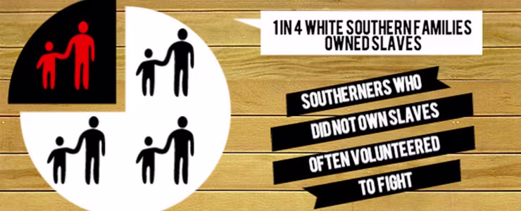
Melanie wanted to try another infographic tool and found that Piktochart was a better fit for her. She talked about how the population statistics stood out the most to her and how there was a potential difference between slave owners and non-slave owners in the South.
Parker discussed what infogr.am is, how it can be used to show learning, embedded his infographic, and then discussed in detail how he selected statistics and facts. He even integrated a word cloud, something unique from his classmates. (Please note: The interactive elements of infogr.am work best when viewed using the Mozilla Firefox browser.)
I shared a few of my students' creations with my PLN on Twitter and got these positive responses:
@KerryHawk02 That is so cool! Well done. One of the best student created infographics I've seen. — Greg Kulowiec (@gregkulowiec) March 7, 2014
@KerryHawk02 Love this. Would work well in Econ. & Social Class unit of US history. Thanks for sharing! — Molly Smith (@historyfriend) March 7, 2014
I'm not going to tell you that the process was not without some frustration. For some students, the struggle was with the data analysis and understanding how the numbers I provided related to strategy and success in war. For others, learning a new tech tool was difficult and they had to use some trial and error. In the end, everyone accomplished the goal of learning how data can help us understand history and providing proof of this learning. Also, I think they realized that those fancy infographics they see all over the Internet don't seem so fancy after all now that they can create them too!
NOTE: This article is an entry in EdSurge's Fifty States Initiative, and was originally published on Gallagher's blog.
Popular on Edsurge
Voices of Change


