There is a silent epidemic affecting our teachers and students, unintentionally enabled in some ways by educators and edtech entrepreneurs.
The idea of "data-driven reform" is a big part of the promise offered by education technology. Unfortunately, research over the years has suggested that many teachers and administrators may be misinterpreting student performance data in their traditional formats. A 2010 report from ETS suggests that district-level policymakers often find these reports "complex, difficult to read, and even harder to interpret." (p. i) Similarly, a 2011 study prepared by the SRI for the U.S. Department of Education found that even in districts "with a reputation for supporting data-driven decision making, some teachers struggled to make sense of the data representations...[e]specially when the question called for framing queries for data systems or making sense of differences or trends." (p. 61)
With few guidelines on communicating data in the manner most likely to render accurate analyses, it’s no wonder many educators misinterpret the numbers. This is especially commonplace for student performance data, which looks simple at first glance but can be difficult to interpret and analyze.
An Example
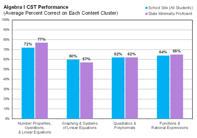
Look at this graph of performance data: blue bars show how the school performed and purple bars show the "State Minimally Proficient" (the percentage of all students in the state who earned the minimum score needed to be considered "proficient"). A school might refer to a graph like this to determine its likely strengths and weaknesses, as measured by one particular assessment. The test in question is from California’s STAR Program, but graphs like this are also commonplace in other assessment programs.
Now let's try using this graph to answer a common question: which area is most likely the school’s strength?
Most educators will tell you the likely school strength is Number Properties. After all, Number Properties is the cluster with the highest blue bar for the school and thus the highest percent correct for the school. The correct answer according to this particular assessment’s analysis guidelines, however, is Graphing & Systems, which will likely be mistaken for the school’s weakest area because it is the lowest blue bar. The most common interpretation of this data is the opposite of the accurate interpretation. I’ll explain…

If you read this particular assessment’s 140-page (significantly shortened in recent years) Post-Test Guide and its 624-page Technical Report, you could find (buried) brief mentions of the fact that its reporting clusters vary in difficulty and need to be compared to statewide performance (e.g., State Minimally Proficient students’ scores) to gather meaning. Thus Graphing & Systems is the school strength, since only here did the school outperform others in the state.
Yet do we expect or want each educator to wade through pages and pages of post-test documentation to understand this fact when analyzing this data? That would be a gross misuse of educators’ already overtaxed time.
An Alternative
What if there were standard guidelines for how edtech reporting systems can present their data in a clear manner, while offering educators clear guidance on how to interpret the results?
Since data is used to shape instruction, leaving out helpful explanations is akin to selling over-the-counter meds without labels. (You would never take flu medicine from a container merely reading "Flu," would you?)
Along this line, edtech products that provide data to educators can adhere to what I call “over-the-counter” data (OTCD) standards, which evolved during my dissertation research and survey of studies across a variety of fields--including education, behavioral economics, design, business analytics, technology--to glean insights on how to present complex data in ways users will understand.
As the name suggests, OTCD is inspired by the ways that over-the-counter medication provides clear instructions on the proper use of its contents, from its clear label, the supplemental documentation tucked inside the box, access to online resources like WebMD, appropriate package/display, and effective contents (i.e., a pill has to actually do what it’s supposed to do).
Below is a summary of five major areas where edtech companies could apply the principles from medication packaging to offer clearer guidance and instructions when it comes to their data reporting environments. (Here's the full description.)
In addition, here's a checklist that further breaks down these components into actionable steps.
| Component | You've Seen It Look Like This in Over-the-Counter Medication | It Can Look Like This in Data Systems & Their Reports | ||
| Labels | The container label provides the name and info to questions like, "How many should I take?" and "What are the possible side effects?", etc. | The report has a clear and concise title, and included in the footer or side are annotations that provide info most relevant and important to the report. | ||
| Supplemental Documentation | Not all of the info a user needs to know can fit on the label, so a folded-up piece of paper is enclosed within the package to offer further explanation. | Similarly, explanatory info can accompany each report via links to an abstract or interpretation guide specific to each report. | ||
| Help System | Users want an online help system to explore and discuss specific questions. (Approximately 50 million people user WebMD every year.) | An online help system that offers comprehensive lessons on using the system and interpreting analyses that are specific to the assessments and data. | ||
| Package and Display | Helps communicate effectively by clearly identifying the most important information, such as the purpose and use. | Design consistency in how data is displayed and a clear layout helps to avoid confusion. (See in particular this 2011 usability study from ETS on reporting systems) | ||
| Contents | The ingredients of the product are vital; they have to be effective, user-appropriate and not expired. | The data system's contents (suite of reports) cover key needs, such as input controls that help users navigate the data, and actual data is reliable and timely. |
Raising the Bar
To answer this article’s rhetorical question, data reports are not just “useless” if educators misunderstand and use them to inform decisions impacting students. It can be outright harmful and carry severe consequences.
It’s time to hold edtech products to higher standards when communicating data so educators have the support they need when working hard on behalf of students. Educators are already working to improve data use with increased professional development and staffing, but the new generation of reporting tools has to make their jobs much easier. It’s time for edtech data reporting systems to do more to help end the data analysis error epidemic.

